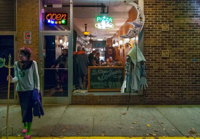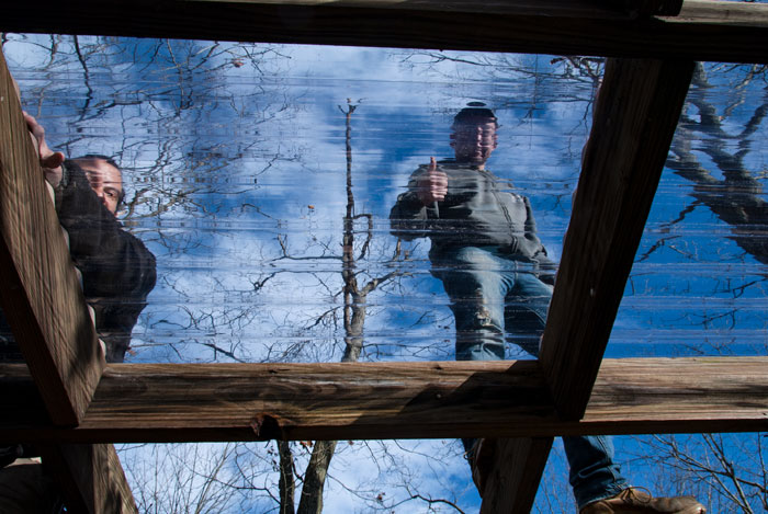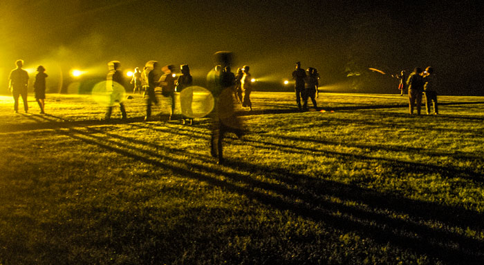
Hudson Valley Shakespeare intermission, Boscobel
 years
years 


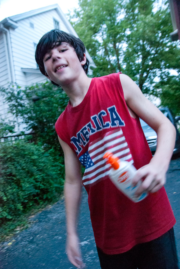
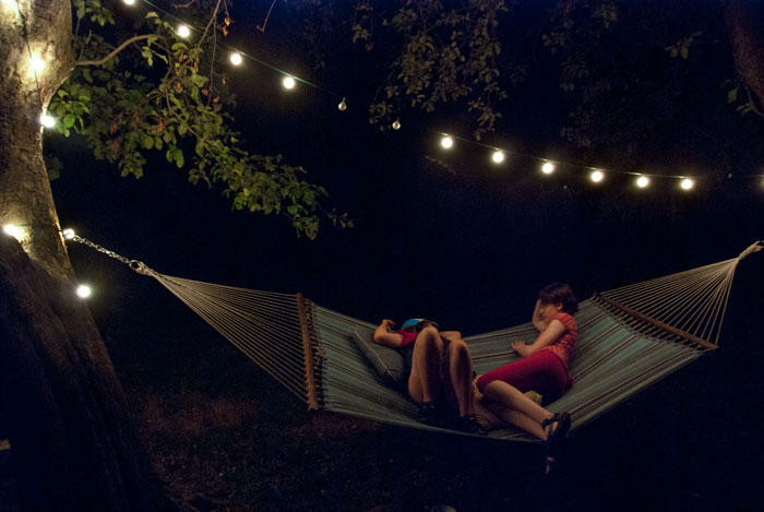
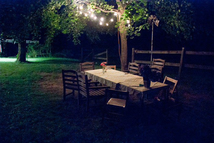
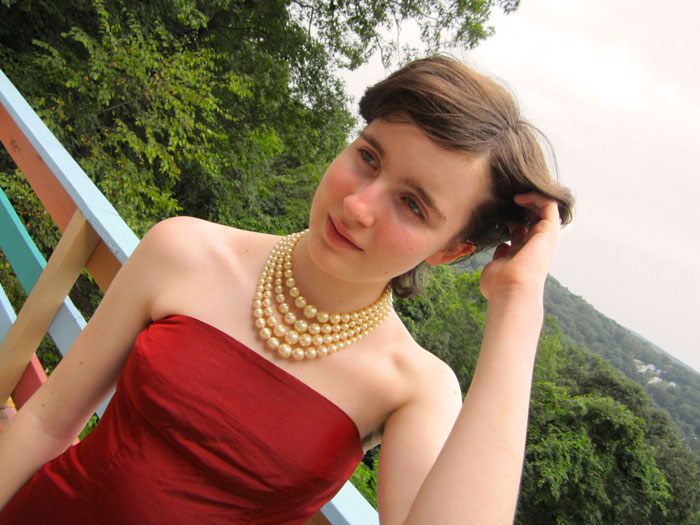
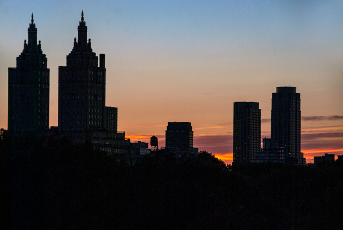
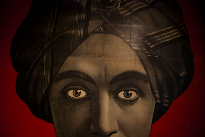
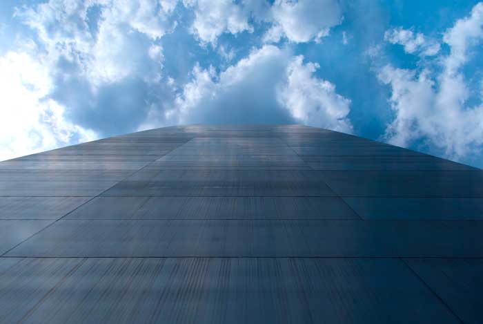


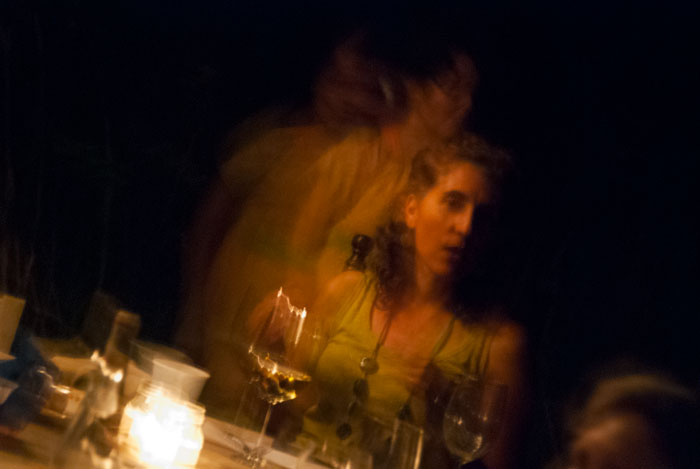
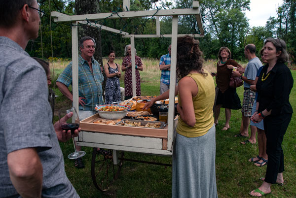
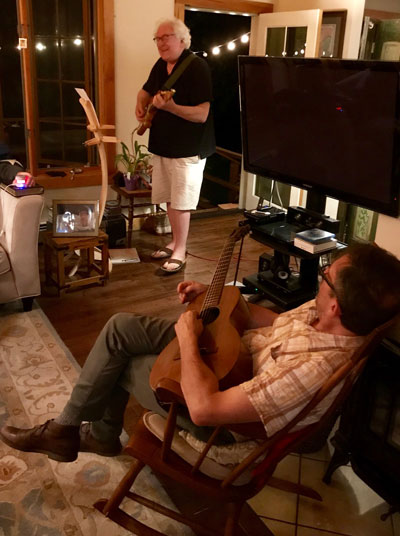 Christine and Mike, neighbors never more than a couple miles away from our former home in Putnam County, hold an annual dinner on the palatial lawn of their home. Christine is a fabulous cook and the food, wheeled out to the table on a rustic cart, is always great. A huge tree hanging over our heads is the only overhead illumination; it's wrapped in Xmas lights.
The dinner is the occasion for a country version of a salon; guests are invited to perform or display whatever creative endeavor they've been working at. Carolyn and I (and sometimes H) have done all sorts of things; I've shown videos, shown prints, played new mixes. The crowd is, mercifully, always polite. A solo performance of "My Disillusionment" at the salon a couple of years ago was my last gig to date. I wrote the tune in 1980 for Desi, Desi, and Desi and managed to get a decent version on an 8-track reel-to-reel around the turn of the century.
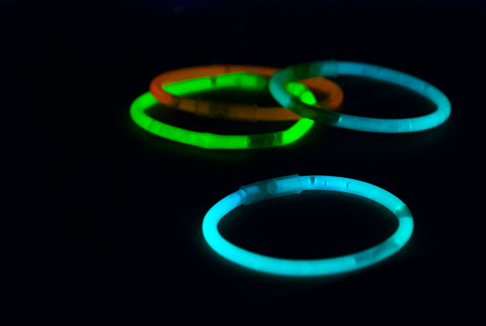
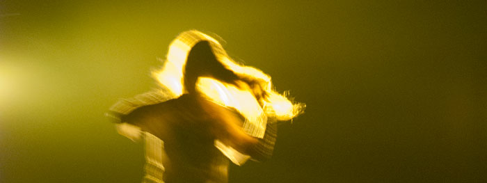
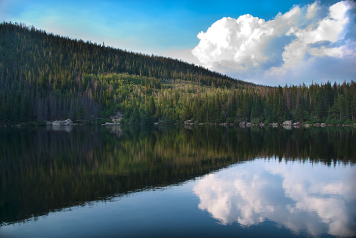
I used part of the image above in the cover art for my mid-2000s What You Want collection. I've yet to find a more ironic title, since my recorded output falls upon release into a black hole. My enthusiasm for the development of the internet was due to the possibilities of self-publishing. (Wow! I can get everything I've ever done out to the public!) I did not realize, as so many others have discovered, how insignificant any individual contribution can become when contrasted with a billion other contributions.
When I was teaching classes in Photoshop my students were sometimes reluctant to put their creations on the web, lest they be stolen. I told them the problem wasn't theft but inattention, true right up till the development of AI. Now our work can be plundered without anyone ever having to look at it.
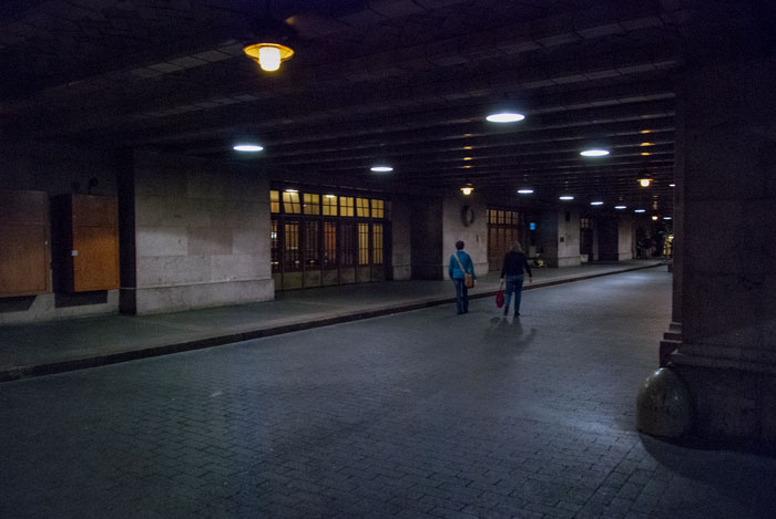
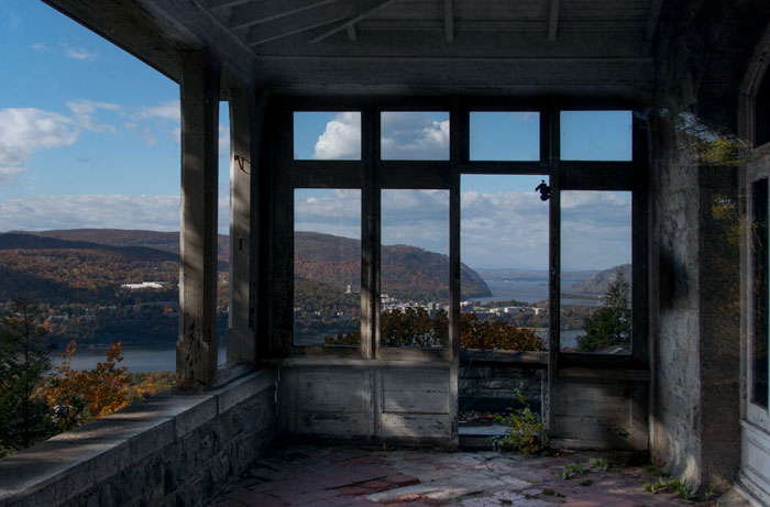
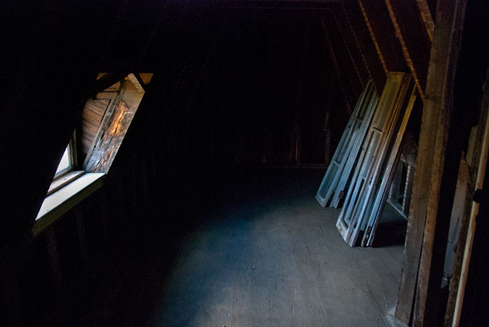
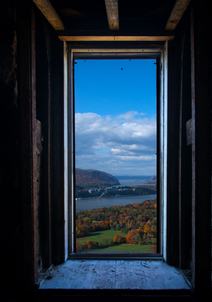
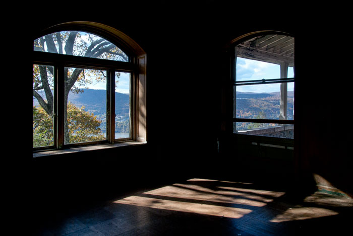
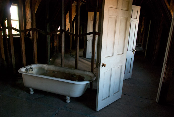

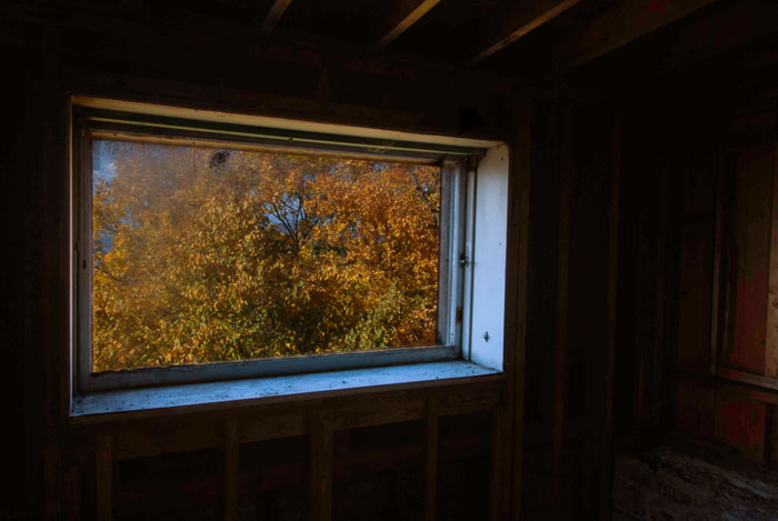
There is a thing with me and photos. No matter how well-composed, executed, and/or masterfully sanded-down in Photoshop, they are not the work of a real photographer. Why is that? I don’t know; I’ve never known. Somehow it’s me on one side and artists on the other.
I’m sure of one thing: there is no central motivating idea in my images, while that is often the case with the people I see hanging in Fotografiska. Sometimes this idea is not interesting; it might even be a bad idea. But it’s there, some mysterious organizing concept that I’ve never extended to more than a few images at a time. Some photographers spend their whole lives refining the one concept; it can make their work unmistakeable.
I've been critiqued a few times by professionals in the image business; it made me so depressed I didn't take another picture for months. They couldn’t define exactly what was missing, either. We both sat on opposite sides of a desk with my portfolio on it and knew something wasn’t there.
It’s not that my pictures suck. I recognize some aren't bad. I take thousands of photographs; there's bound to be a few happy accidents. It works like that probability fable of the monkeys and the typewriters. Nonetheless I think even the best captures—all of them, really—can be improved.
So let me talk about that, the elbow grease part.
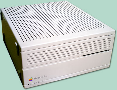 The tool I use to make pictures better is Photoshop, a program I've been using since version 1-point-something in 1990; it was one of three reasons I bought my first Macintosh computer (a IIcx). The second reason was a program for music sequencing called Performer. The third reason was Apple's design in hardware and software. I'm a fool for ergonomics and Steve Jobs, though certainly flawed, was a genius.
To say Apple changed my life is not an exaggeration. It gave me the immediate capability to work with text, images, and music—later video—all with the most sophisticated toolkits available. I became so fascinated by the potential that I went for a Masters at the Interactive Telecommunications Program at NYU. I discovered programming with the Mac; I got jobs. I had a business, I made products. I taught this stuff in college.
I'm still using both Performer (now Digital Performer) and Photoshop. I work with Photoshop every day of the week. I still use a Mac, too, though I've broken my addiction to desktop machines; this is being written on a MacBook Pro. I don't even know how many Macintosh computers I've had over the years: probably seven or eight of the laptops, and four or five of the desktops. Most of them weren't new, like the cars I used to own when I lived outside of this city.
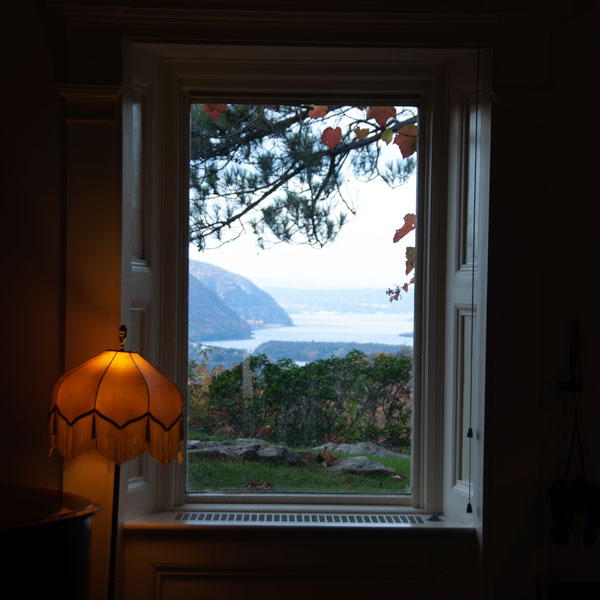
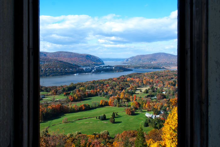
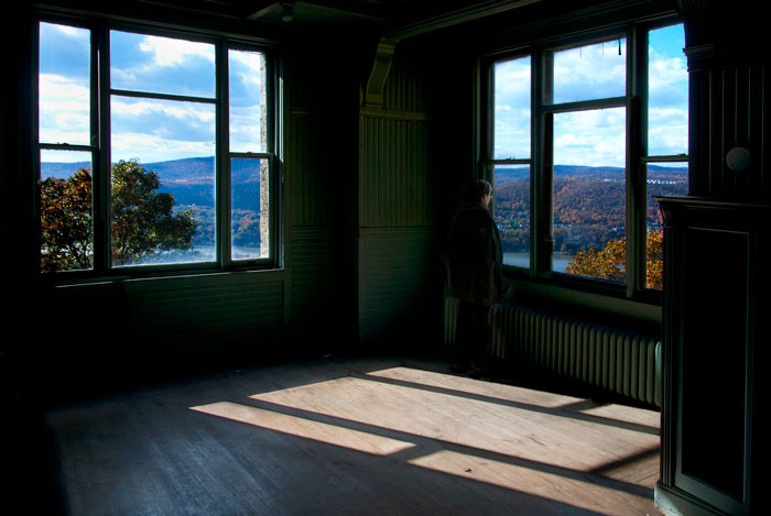
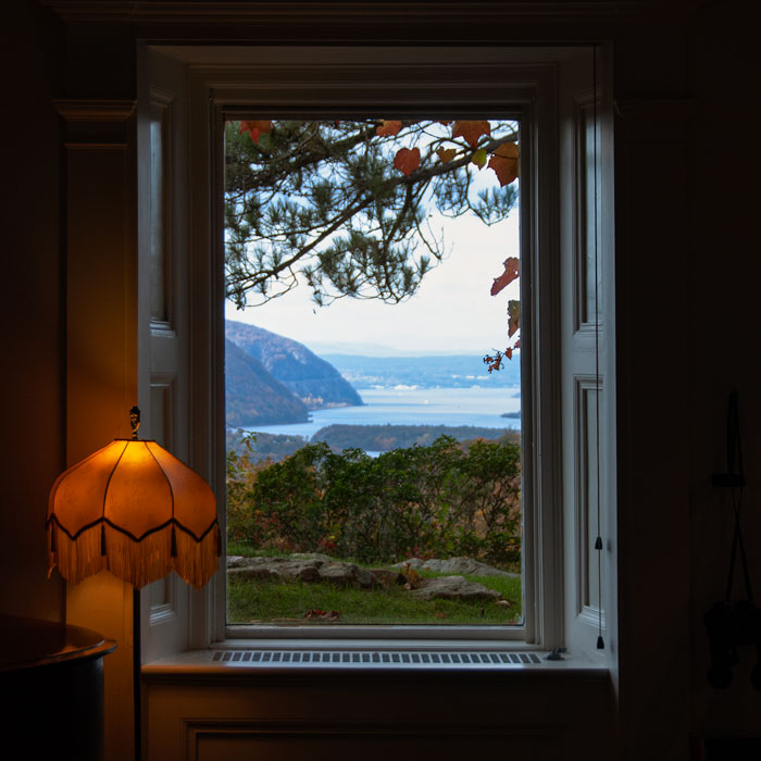
When I first looked at this view through a Hudson Valley window I thought it had potential; it popped out of the digital contact sheet automatically generated in Lightroom, the photo management tool I use. An image somehow pulls at the eye; I pore through other thumbnails and then find myself returning. I don't know why one picture seems better than another; the process of choosing is mysterious. The brain is evaluating, considering, pulled in one direction then another. The pick is rarely the result of a conscious decision, at least for me. All I do consciously is try to listen to what my head is saying, and it doesn't say anything loud.
Two problems presented themselves as I looked and both could be fixed on the computer: distortion and exposure. Distortion is inherent in a spherical lens and there are many ways to deal with it. In addition I hadn't leveled the shot very well and a small amount of rotation was needed.
The distortion issues had to be dealt with first. All those masks one makes fixing the exposure get a little wonky if major straightening adjustments haven't been finished. In this case the window frame helped considerably. I superimposed perfectly horizontal and vertical guidelines and placed them near the edges of the frame. Then I selected the entire image and pulled and twisted its corners until the edges paralleled the guides. The process is simple but you alway lose portions of the image near the boundaries of the frame; that's fixed by either cropping out these areas or using the Clone Stamp tool to repopulate them with pixels.
The lamp on the left was the biggest problem. Like the floor lamps in other people's homes it leans a bit. When I sit on these same people's couches and look at their leaning floor lamps it's as if I have an itch in my back I can't quite reach. Don't invite me over; I'm a terrible guest. At least I've learned enough over the years to no longer grab the remote out of someone's hand and "correct" their television sets.
The leaning lamp made the entire image sloppy, and I am compelled to make the crooked straight. Doing so was surpisingly complicated. First I selected a rectangle containing the lamp; I copied it and then pasted it onto another layer. I rotated this layer until the post was a perfect ninety degrees from the plane of the floor. When I got rid of any parts of this layer that didn't contain the corrected lamp, parts of the original leaning lamp became visible. I had to return to the original layer and get rid of those traces. This was mostly done with the Clone Stamp tool though I had to use "all my powers" (paraphrasing Don Corleone to the undertaker) to eliminate them. The left edge of the windowsill was particularly dicey, and, continuing the analogy, was as hard to fix as Sonny's face. (“I don't want his mother to see him this way.”)
After completing the geometric editing I advanced to the exposure issues. These are typically easy to fix, especially when, as in this image, I shot it RAW. This format ensures that every photon strike upon the camera's sensor is preserved; there is no processing of the image and no compression of the image.
One can shoot RAW with sophisticated smart phones but most people don't; therefore almost all images shot with phones and other consumer cameras are compressed. In the post-processing of the image—the Photoshop part—a compressed file doesn't yield as much information. Pixels have literally been eliminated to enable smaller file sizes. Since I was shooting RAW there was quite a bit of extra information in the pixels, most found in the darker areas of the frame. In other words there is more detail in the shadows.
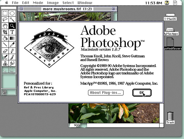
Masking, an essential PS trick, is the technique that allows me to lighten the darkness without blowing-out (eliminating detail) in the well-lit or possibly overexposed areas—in this case the view through the window and parts of the lampshade. I used the Camera Raw Filter, a Levels adjustment layer, and a Curves adjustment layer to bring up the shadows in the unmasked, darker areas of the pic. Then I reversed the mask and worked on the lighter parts, using various tools to get middle-range areas more saturated with color and detail.
I almost always work this way. I don't know why straightened, measured, perfectly exposed frames make me happier, but they do. With the new AI tools rapidly infiltrating the Photoshop toolbox, none of this handwork will be necessary—and calling stuff done with a trackpad, keyboard, silicon circuitry, and a monitor “handwork” is amusing anyway. I’ve been resistant to using these tools, but the pursuit of technical perfection is another mark of the bourgeois thinker, a label I give to myself. In high school I worshipped the fastidiousness of prog rock while the messy wonder of Little Richard—recording with only one mic in a wooden-floored backroom—went right over my head.
